Our brand
One brand strategy
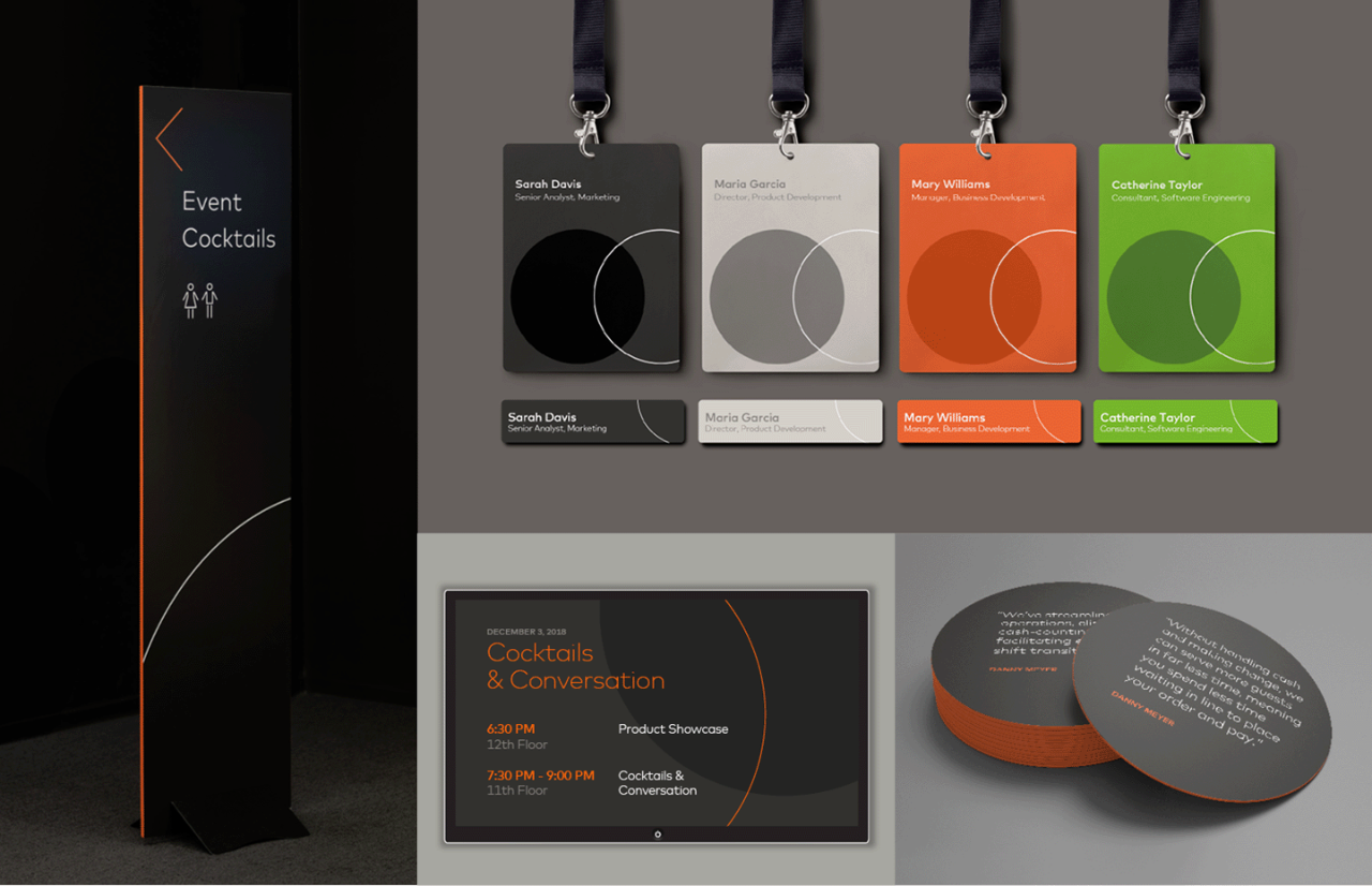
Brand expression
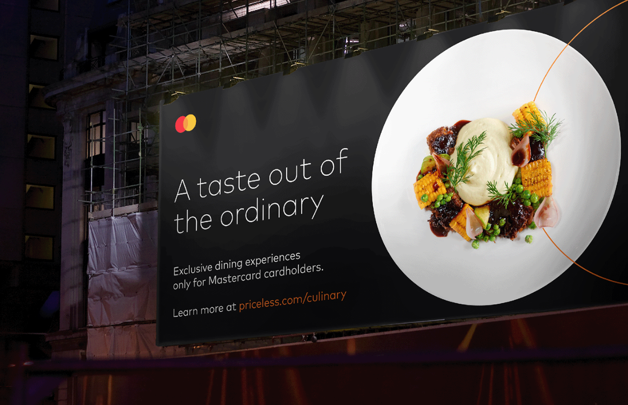
Power of Priceless
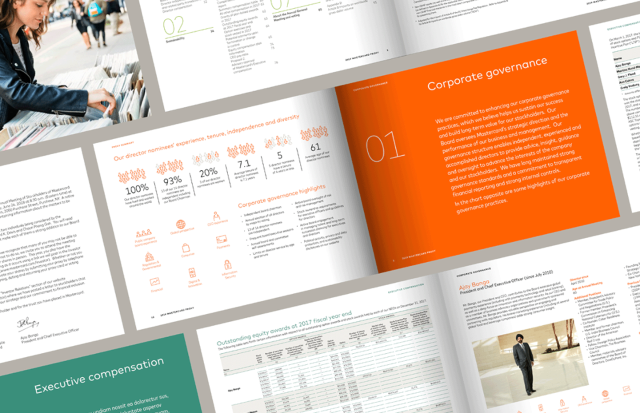
Asset Library
KEY TAKEWAYS
Enhance readability
When we use effective line spacing and arrange our type in uncluttered layouts, we enhance the readability of our communications, which helps people take in information efficiently.
If technical restrictions apply, use our substitute typefaces. In order of preference: Century Gothic, then Noto Sans.
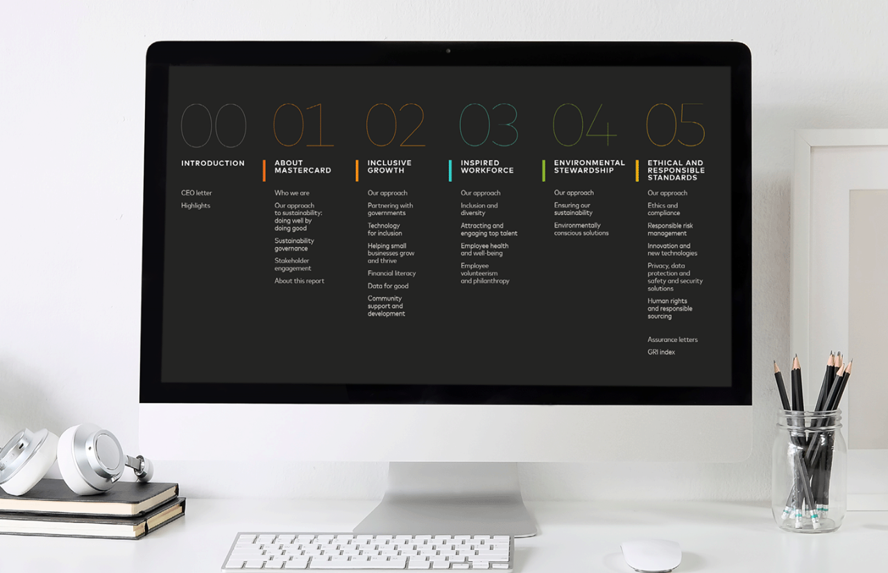
Apply as a graphic element
Our type has great impact when used independently as a graphic element to deliver powerful messages.
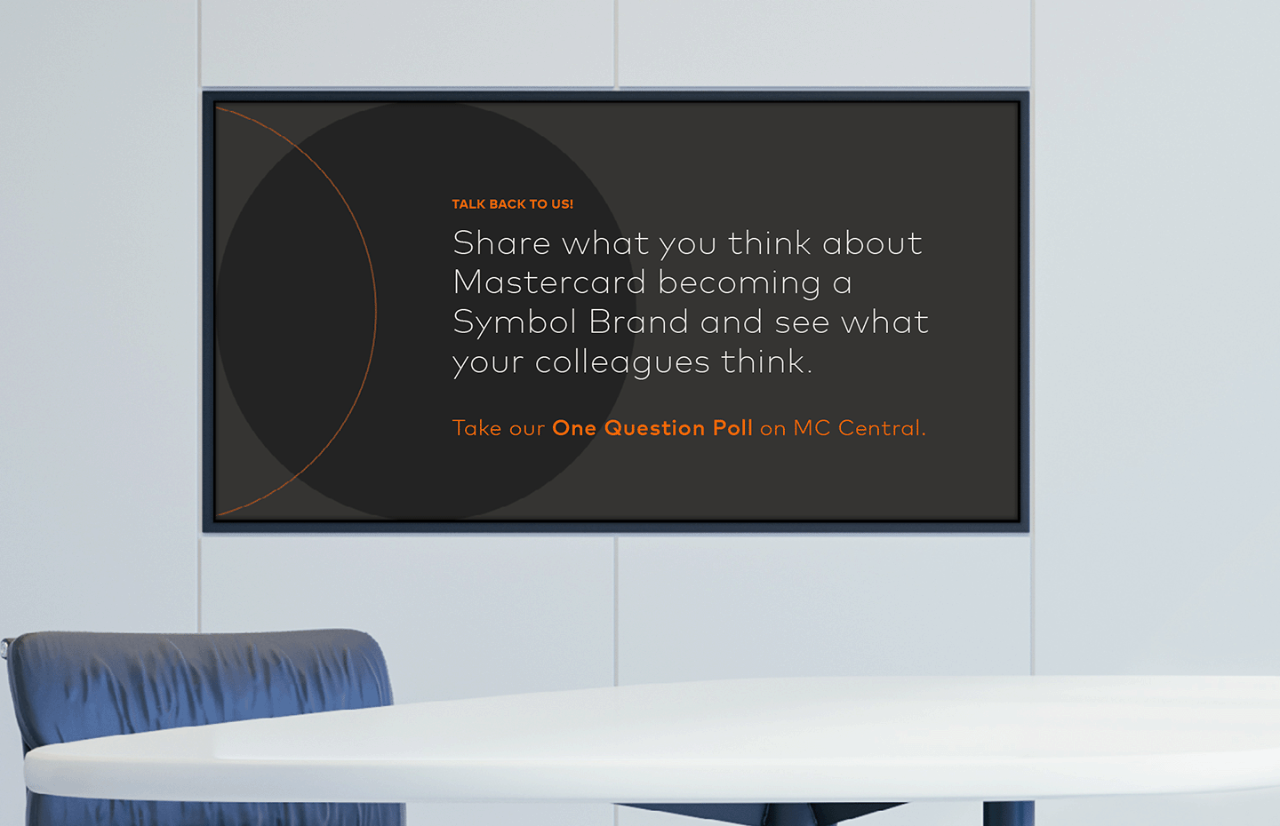
Using bold Use bold sparingly for subtitles, eyebrows, emphasis, and dates.
Sizes and weights Choose sizes and weights that have presence but don’t shout.
Emphasis Use type with control to emphasize key insights.
Essential tools
Mark for MC is our unique signature and an extension of our tone of voice. The way words appear is as important as the words we choose. Considered use of type helps reinforce everything we say.
UNIQUELY MASTERCARD
DID YOU KNOW?
It didn’t take long to land on the typeface that was right for Mastercard. Mark for MC is not only modern and sophisticated, but it also echoes the circles found in our Symbol. Used in the right way, it can be a primary brand cue.
People process color even before shape or language. This means that color is a powerful way of communicating identity instantly.