
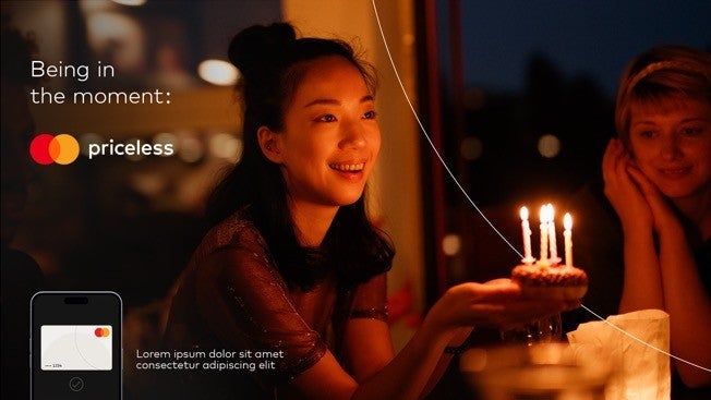
Priceless is at the forefront of everything we do with our brand. When leveraging priceless for activations and campaigns its important that priceless is rooted in an emotional outcome and makes people feel more connected to Mastercard than before.
Common themes for determining if something is priceless is that it should have human impact and connection, feature emotion, be relatable to the audience, tied to an experience, moment or outcome and can tell a story.
If you have questions, please contact us
KEY TAKEAWAYS
Priceless should not be used for something that is purely functional or transactional like a discount. In addition, just because something is fancy or expensive doesn’t automatically make it priceless.
Using priceless as an adjective before a noun should be avoided (i.e., I just had a priceless conversation). This is in an effort to protect the magic of priceless and avoid trivializing it.
Currently we should not be naming new things priceless outside of the existing priceless pillars, Priceless Planet Coalition and priceless naming exceptions related to our multi-sensory strategy (restaurant, fragrance, album).
Essential tools
SPECIFICATIONS
Configurations
Priceless should no longer be set in orange italic in layouts.

Standard lockup (for most applications)

High visibility lockup (for large format environmental signage)
Minimum size
Always reproduce the priceless lockup at a size that is clear and legible (depending on screen/print resolution). Never use the lockup at a size smaller than the minimum size requirements.

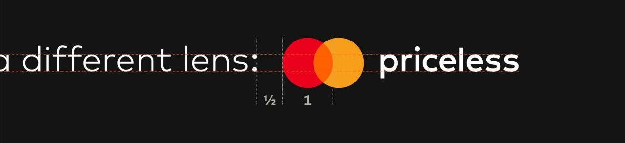
Standard minimum size: 13.5mm
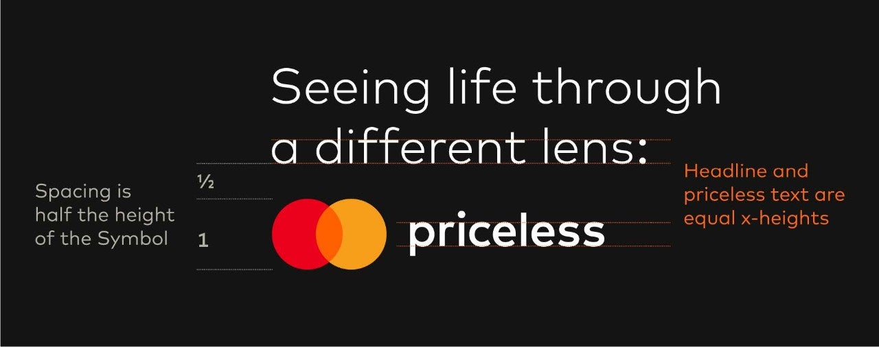
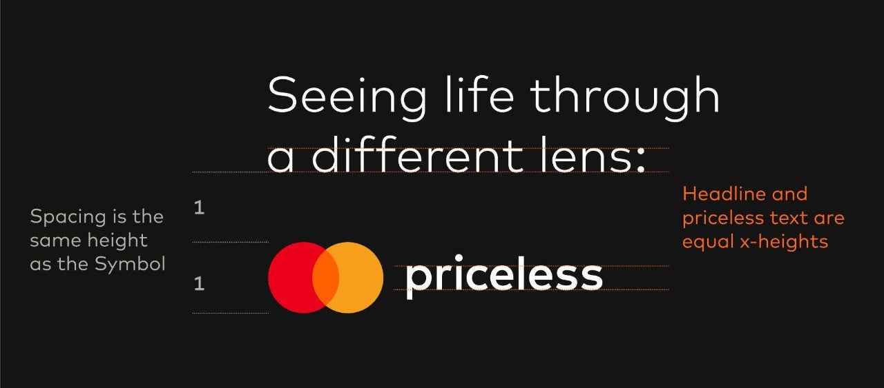
Clear space
Always surround the priceless lockup with sufficient clear space. Based on “X”, which is equal to the height of the Mastercard Symbol, general clear space should be half X.
General clear space
Read-through campaign clear space
Background contrast
Always provide sufficient light or dark contrast with the background against which the lockup appears.


COMMON MISTAKES

Priceless should no longer be set in orange italic in layouts.

Do not use the priceless lockup directly next to the Mastercard Symbol. If you are creating a priceless ad, use the priceless lockup unless the ad allows for plenty of space for both the priceless lockup and the Mastercard Symbol to appear significantly separate from each other.

There is no one-color version of the priceless lockup.

There is no stacked or vertical version of the priceless lockup.
IN USE
Use in motion
In video and animations, use the priceless lockup end frame accompanied by an approved sound logo.
Use in text
When writing priceless within copy, use Mark for MC Medium for the word “priceless” with a lowercase "p".
Legal and trademarking guidance
No ™ or ® is required for the priceless lockup. A trademark ownership legal line is no longer required for priceless marketing materials, except on: Mastercard owned and 3rd party websites and email communications, or if required by parity rule which is outlined in the full legal guidance here.
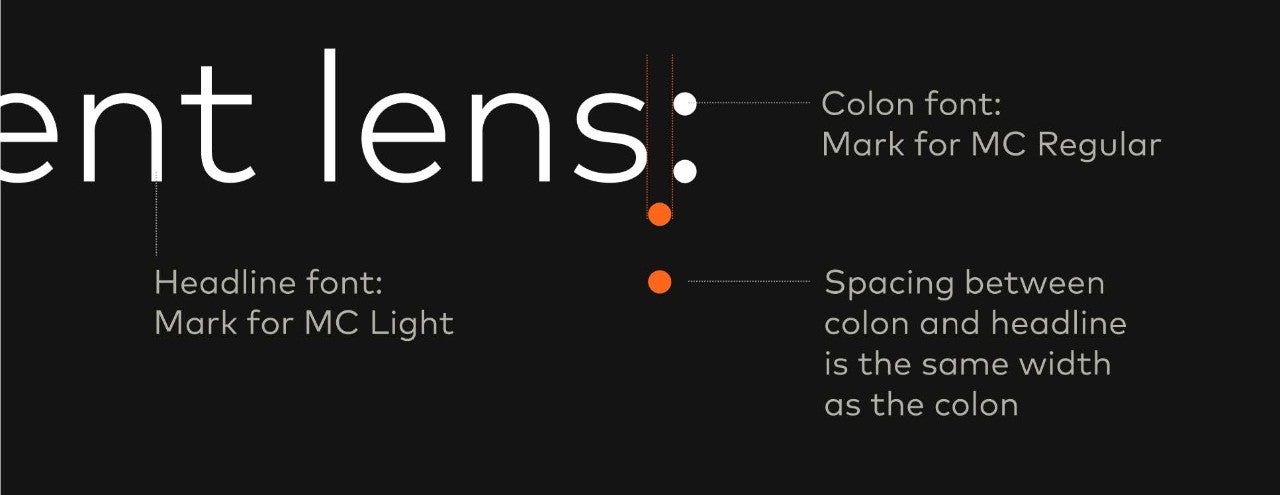
Colon treatment
Condensed spacing
Optimal spacing
Horizontal spacing for extreme landscape formats
Campaign layout components
Use in partner and co-branding materials
Feature priceless using the priceless lockup. Where possible, put the co-brand lockup in a place where it will not compete with the priceless lockup while ensuring you’re still following your sponsorship partner guidelines.
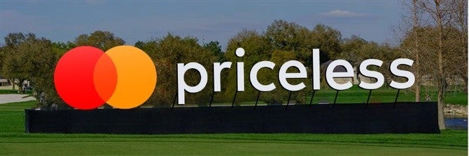
In sponsorship activations, the priceless lockup should be used on environmental signage and throughout installation touchpoints without co-branded lockups present (e.g., lounge signage or leaderboards).
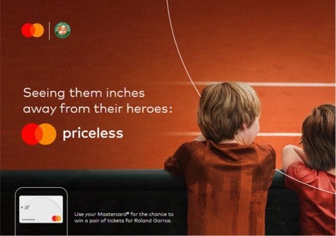
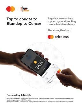
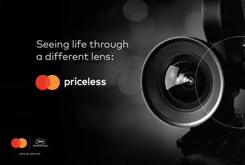
CO-BRANDED EXAMPLES WITH PRICELESS IN COPY (USING THE STANDARD VERSION)
ENVIRONMENTAL INSTALLATION EXAMPLE (USING THE HIGH-VISIBILITY VERSION)